Richard Fudge
Good design for a greater good.
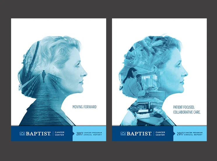
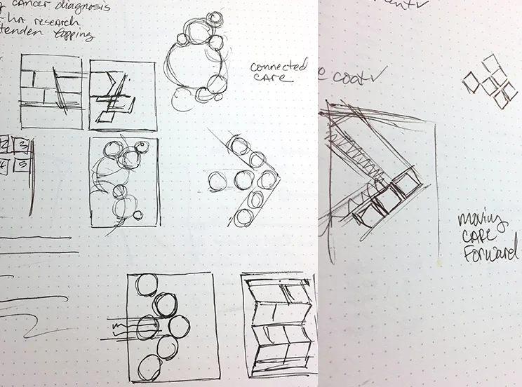
Sometimes you have to go back to the drawing board on a concept. The client had initially requested the cover have a theme of 'Cancer is a Journey'. I learned a new Photoshop technique and presented some cover concepts for that theme.
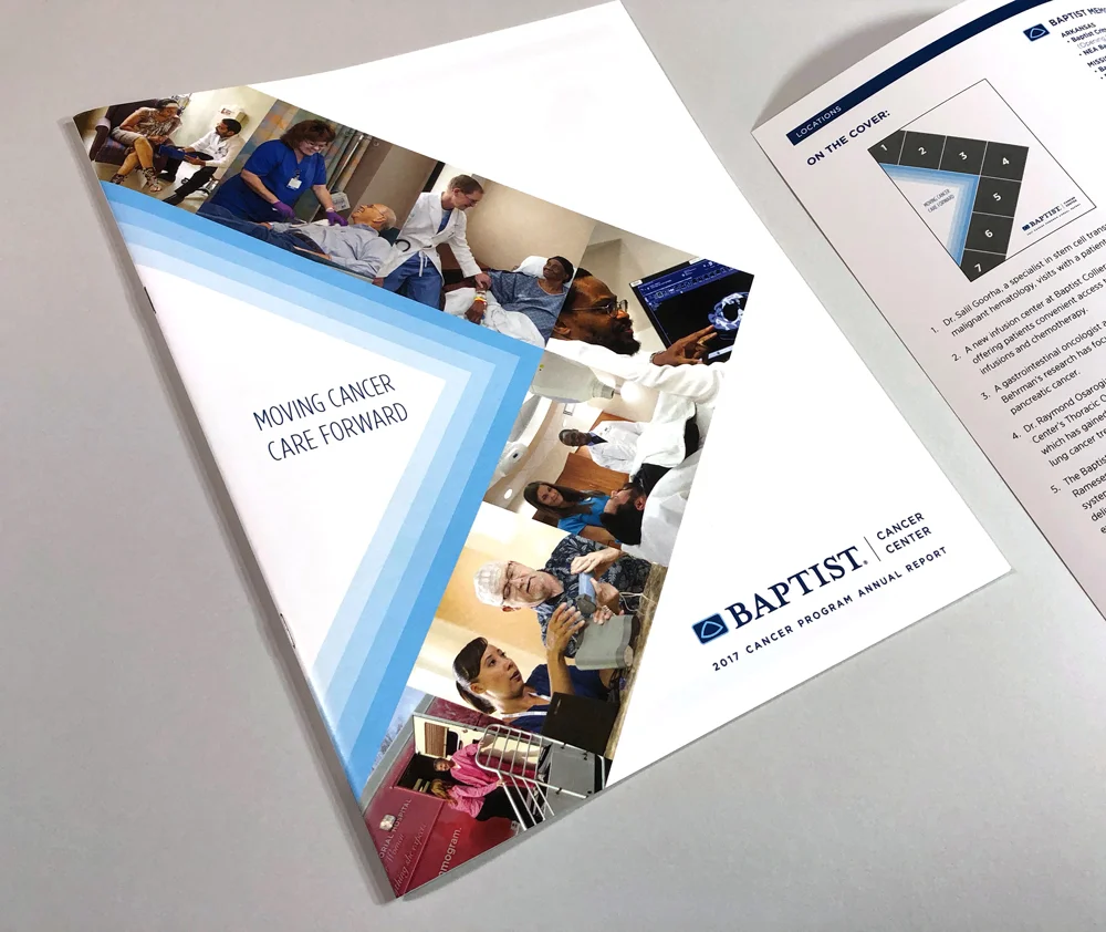
But the copy of the report actually focused more on many different ways that Baptist is leading through innovation, clinical research and expertise. My ‘cool’ cover design wasn’t a good fit. I didn’t want the cover to be just a collage of photos. I wanted the cover to support the message. An arrow seemed like the clearest way to illustrate advancement and leading the way. As a bonus, the inside cover clearly labels each photo and explains their significance.